How to Assemble a Photoshoot Outfit: My Foolproof Formula
- Laurie Neale
- May 4
- 5 min read

Hint of Honey is soft, warm, and natural
In this post I've aimed to keep it super simple and easy to follow.
If you're curious why something is recommended, you can click the underlined text and I'll take you to the section on what to avoid, so you can understand the reason.
The Feel
Soft, warm, natural. Our ultimate goal is to create images that show connection and story through movement. So assembling your photoshoot outfit should support that goal.
It's good to keep in mind the location when you choose, as some colours will naturally be supported better by the environment. I'm always happy to make recommendations as we go through the process!
The Colour Palette
To help you choose, I've included a breakdown of the neutrals and dominant colours that I recommend for my style. You can refer back to this chart as you read through the formula.

The Fabrics
Natural, earthy fabrics are the heart of this style. Think linen, cotton, knits, and crochet. Keep dresses and skirts flowy. Avoid tight, stiff clothing.
My Photoshoot Outfit Formula (with Pictures)
This step-by-step formula will help you easily assemble photoshoot outfits for your family.

Step 1: Choose One Soft Neutral Base in a Light Colour
Choose just one and stick to it. Don't mix grey AND beige, for example. Try to be consistent with the tone of the neutral. The more colours you mix, the more complicated the colour theory becomes, and the more likely the photos will appear haphazard and non-harmonious. When choosing dresses, opt for flowy natural materials.
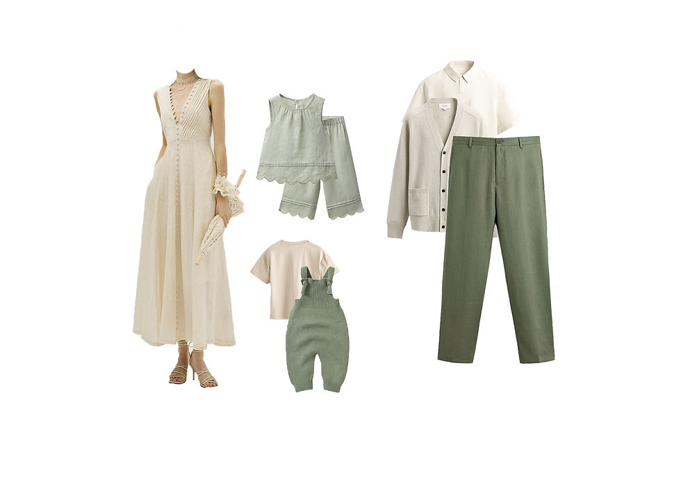
Step 2: Choose One Dominant Colour
Choose a dominant colour, but make sure the clothes are in the same colour family and the same tonal range (how muted or bright they are). You can vary the lightness and darkness somewhat, but avoid bright colours, especially in purple, magenta, blue, teal, red and green. Keep light colours near your face, darker colours can be used for pants and skirts, but lighter (not brighter) is always better for this style.

Step 3: Add Muted Accents
Choose muted accents for jewelry, shawls, shoes and bows, ties etc. Small items can be dark, but ensure they are from the same colour families as the neutral or the dominant colour. Avoid bright colours, especially in purple, magenta, blue, teal, red and green.

Optional : One Soft, Low Contrast Floral Pattern
Make sure the colours of the pattern are within the neutral and dominant colour schemes chosen in steps 1 and 2. Avoid the following: large/bright flowers, high contrast patterns, geometric patterns, stripes, houndstooth, herringbone, and chevron. Stick to one pattern. Avoid mixing patterns.

Optional: One Textured Item
The key here is to choose nicely textured elements that don't clash. Keep them within the light neutral and dominant colours you chose in steps 1 and 2. Avoid bright colours. Shawls, tops, vests, and scarves work wonderfully here.
The Final Word
Always remember, less is more. If in doubt, simplify. Oh, and did I mention avoid bright colours?
I've included a photo below with my editing style applied. You can see how the outfits warmed up. This is important to consider since the colours you wear won't exactly be the colours in the photo. It is especially noticeable with purple, magenta, and red.

What to Avoid
A quick test is: if it feels bold in real life, it's too bold for this style. But let's break down what you should avoid and why.
Here's a quick summary of what I'll cover
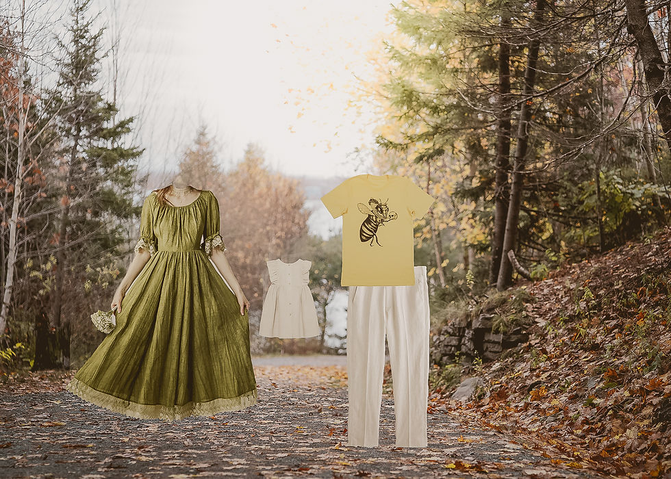
Avoid Bright and Neon Colours
There are a couple reasons not to wear these colours. First and foremost, bright colours reflect into your face and can cause a lot of problems later when editing. All are difficult but especially green, blue, teal, and purple. Nobody wants a blue, purple, or green face!
The other reason is simply the vibe.
For example, look at these two dresses together, it's pretty easy to see which one harmonizes with my style.

I actually love the bright striped dress, but it seems out of place in warm, earthy contexts. Notice how it looks almost radioactive with my editing style. On the other hand, the orange dress harmonizes with the leaves,
But in the right place, like this bright, cool tropical beach (picture is from the ad for this dress), the striped dress looks fresh and breezy.

Avoid Mixing Too Many Colours
My formula is designed to avoid exactly this. If you start mixing different colours, tones, and shades without a sound knowledge of colour theory, the resulting photos can look busy and haphazard.

Avoid Darks Colours, Especially Near Your Face
Darker colours fight with the light and airy style, weighing it down instead of giving it lift. Plus the lighter colours will give you a little face lift; they diffuse wrinkles and imperfections.
If you must wear darker colours, reserve them for skirts and pants.
Take a look at this photo. The blacks get lifted to grey, and then it just doesn't have the same floating, light feeling. It's not that the outfits are bad! In fact it takes into account every recommendation I make except to avoid black and dark clothing.
If you were to show up in these outfits we would capture fantastic photos that are cohesive and harmonious. But I wouldn't categorize the resulting photos as light and airy.

Avoid Blocky, Geometric and Large Patterns + Don't Mix Patterns
Honestly, the only patterns I would highly recommend for my style are soft, light floral patterns. Everything else seems to fight and distract from you and the natural environment.
Also don't mix different patterns. The more patterns you mix, the less cohesive the final photos look.
In this photo, you can see the geometric pattern doesn't blend in well with the environment. It would do better in an urban location. Notice the opposite for the floral pattern. The flowers are small and not distracting, and the contrast within the dress is minimal.

Avoid Stripes, Houndstooth, Herringbone, and Chevron Patterns
These also fight the environment but they are even more ill advised because they can cause a nasty effect in digital photos called moire. It's hard to identify if it's happening during photoshoots, and difficult to correct later.

Avoid Graphics and Logos
Logos and graphics are casual and so likely won't fit in with the rest of your wardrobe (if you've followed this guide). They are also distracting from the subject: your family and the connection you share.
Avoid Stiff, Tight Clothing
I recommend choosing a longer dresses (think midi or maxi) that have a flowing skirt in linen, cotton, hemp or a similar natural look.
Halifax is frequently windy and short dresses getting blown up can become a real issue. There are a lot of variables at play, especially with kids, and it decreases the chances of landing those great shots.
Plus, my style is geared toward movement, and flowing dresses and skirts help create a sense of movement beautifully. Stiff, skintight clothing will limit how you move and can make posing really awkward.
Avoid Mixing Different Levels of Formality
This is one that happens often. Mom and baby dress up, dad wears a hoodie, graphics T-shirt, and cargo pants. The resulting image lacks cohesiveness and distracts from the vibe.
For Hint of Honey it's not necessary to go all out. Some slacks, loafers, and a linen shirt are all it takes to really make the brief.

Comments